Louisville hasn’t been home to a pro basketball team since the late 1970s when the Kentucky Colonels, a member of the ABA, folded after the ABA was absorbed by the NBA. Since then, we’ve had a fair share of semi-pro teams from the dreaded CatBirds of the mid 1980s to a very short lived Kentucky Colonels in 2004 when ABA 2000 formed.
Since then Louisville has tried to lure an NBA team whenever one has looked to relocate to a new market. As recently as 2010, Louisville made the short list when the then Charlotte Hornets left for greener pastures to New Orleans. Honestly, I’m not sure if anyone outside of the 502 area code ever really took Possibility City as a serious possibility. Until recently.
A few weeks back, Darren Heitner, in his piece for Forbes, touts Louisville as the ideal home for a relocating NBA team. This got our folks thinking. What if? What if investors and the city did land a team?
Instead of keeping the said NBA’s team moniker, let’s assume we’d tap into our pro basketball heritage and rename the team the “Kentucky Colonels”. What would that new logo look like?
Here are a few ideas our creative team came up with….
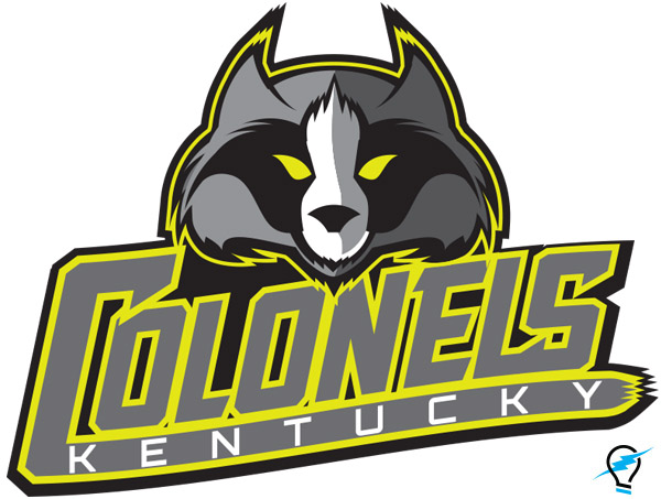
Dennis Bonifer | Does it have to be a Colonel?
I wanted to create a mascot that would be indigenous to the region. I wanted to some how incorporate a Fleur di Lis into the mark. And, finally, I wanted the new icon to be able to have a natural doppleganger as a physical Mascot, not just something out of the blue – I’m talking to you Boomer, of Indiana Pacers fame.
I landed on a raccoon. Sure it’s a stretch for a team called the “Colonels”, but why not?
They are native to the region. A Fleur Dis Lis could be subtly created within its mask and markings. Plus, raccoons are quick, shifty, agile and would make natural ball thief – in an anamorphic Disney character kind of way. And what kid wouldn’t want to watch Colonel the Raccoon goof-off on the sidelines? I also tapped into the original color of the old ABA Kentucky Colonels, chartreuse green, because it’s not only a crazy hot color these days, but it’s a color scheme our new Kentucky Colonels could own within the NBA.
Donovan Sears | Kentucky Attitude
This mark represents a modernized take on the original colonel – giving him some much needed attitude.
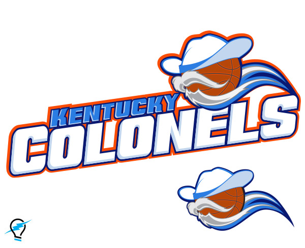
Chaney Given | It’s a basketball with a big hat (and mustache)… It’s funny
When brainstorming about Kentucky Colonels iconography, one particular thing kept coming to mind — the mustache and beard. I drew a quick sketch of a basketball with the facial hair as a joke, but the more I looked at the doodle over the next couple of days the more I started to think it could possibly work.
And there you have it, a Kentucky Colonel basketball.
Mary Kate Zihar | Nitty Gritty
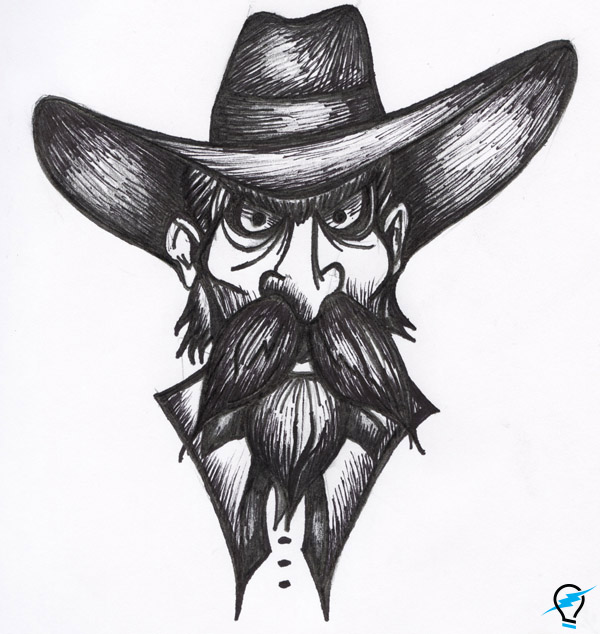
Since I have a background in drawing, I wanted to incorporate my own style into the logo. I liked the thought of having the Colonel look mean and gritty, instead of a happy old man with a white beard and suit. I wanted him to be someone you don’t want to mess with. Which, I think is a trait you want in a team mascot.
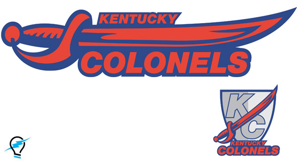
Arica Johnson | Sword Play
I wanted to venture outside of an actual Colonel persona. After fiddling with a few ideas, I ended up going with a sword. I think the sharp edges of the mark and the vibrant colors say “BRING IT!”
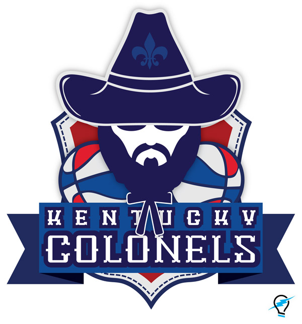
Chelsea Grider | Good Ol’ Kentucky Badassery
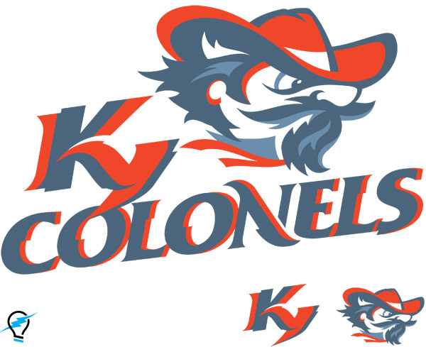
For my Kentucky Colonels NBA logo, I knew I had to pay homage to the classic ABA Kentucky Colonel logo used for the team from 1967-1976. I kept a similar color palate to the old logo – Kentucky Wildcat Blue & Louisville Cardinal Red. If a NBA team did finally land in Kentucky this would be a great way for diehard UK and UofL fans to join together and cheer for one team, UNITED! I incorporated the red, white, and blue basketballs that can be seen in the original KC logo, and were also used during games. I gave the Colonel a more modern simplified look, as well as a more “bad ass” demeanor. I also included the Fluer de Lis to represent the teams home city, Louisville. BRING THE COLONELS BACK HOME!”
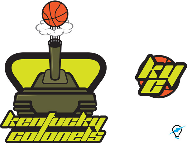
Jim Deweese | Kentucky Cavalry
My idea was to get away from the Southern gentleman and take another meaning – the military colonel. (One of the commenters kind of stole my thunder with the whole military angle, but it was too late to start over!)
I started thinking about Kentucky’s history of being the home of armored cavalry training at Fort Knox for decades and I wanted to give nod to that heritage. I wanted to work in the legacy color of the old Kentucky Colonels, chartreuse, but it could easily be modified to match the black and gold of the US Army.
Plus, I think the theme really has legs for in-arena atmosphere. I love the idea of a uniformed mascot running around the arena with a chrome helmet and a riding crop, dunking off trampolines at half time (Think a hyperactive George S. Patton). T-shirt bazookas. Bomb sound effects when the home team hits a 3. Alternate uniforms with military themes. A dance team called The Special Forces.

