CBS Outdoor’s marketing department has gathered some “before and after” examples of outdoor bulletins that have been given a facelift through the use of extensions and the less is more approach to copywriting.
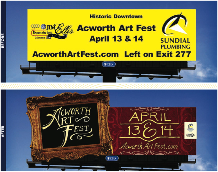
The second version of the Aceworth Art Fest board does a great job of communicating exactly what needs to be communicated…the name, date and where you can find more information. I’m not sure why the sponsors’ logos are the same size as the event name and date on the first version.
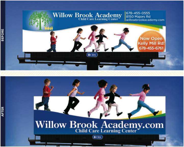
It’s always important to remember the context in which your message will be seen. Outdoor boards, especially bulletins, are usually consumed while someone is driving 60+ MPH. The first version provides too much information, while the second version focuses on the website address, where consumers can go and get the information that has been discarded from the first version.
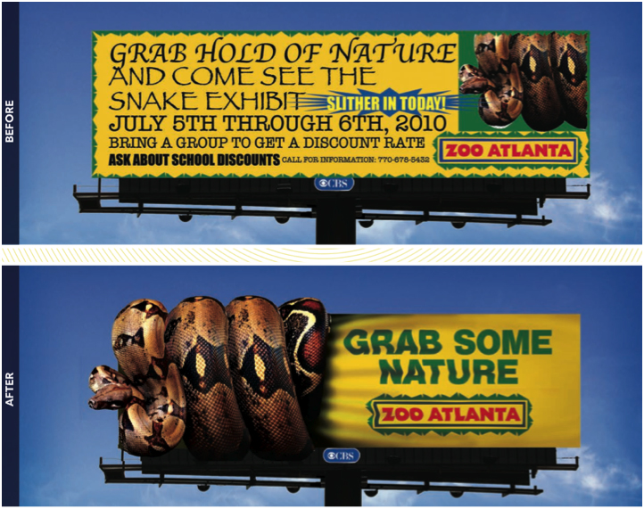
The second version does a great job of communicating the primary message “there are snakes at Zoo Atlanta” and uses the extended space very well. The snake, which is the focus of the message, gets lost in the corner of the first version to make room for all of the information. It would be nearly impossible for someone to see the phone number on the first version…so why include it? If someone wants to find the snakes, they’ll know where to go for more information.
Outdoor space on traditional bulletins can do so much more than simply use the initial 14’ x 48’ space. In addition to using extensions, we can also add lighting, sparkles discs and even radio transmitters.

