I have often said that “just because I own a pipe wrench, that doesn’t make me a plumber.” Unfortunately, owning a computer makes a lot of people think they are a graphic designer. Putting aside the typical technical mistakes and bad clip art for a minute, let’s talk about what drives me (and most professional designers) crazy: bad fonts. Fonts can set a tone, deliver context and provide aesthetic elements to a project. And they can also completely ruin a design project. The following are 5 fonts that I propose we stop using. In fact, trash the files so you are never tempted to “make your design fun.”
1. Carpenter
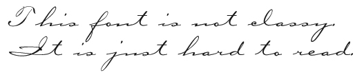
This font was all the rage 10 years ago. You saw it everywhere from wedding invitations to billboards for anything feminine or classy. The problem is that it is impossible to read. Please pick another script face that doesn’t require a second look to decipher.
2. Papyrus

It’s the go-to font for people working on anything to do with nature, history or who are just looking to annoy me. It constantly shows up in museum and zoo design projects. Bottom line: It’s been done. To death. Stop it.
3. Comic Sans

This one has been a problem for a long time and by now, everybody should know better. There are web sites devoted to hatred of this typeface. People think it’s fun and friendly and folks must love it, because it has been around forever. But that doesn’t make it right. Ever.
4. Fajita

Fajita turns up exactly where you would expect it to: Mexican restaurant menus and party invitations. It’s exactly the kind of font my Mom would use to lay out the pages in her church cookbook. And while I love my mother (and her cooking) I hate this font.
5. Hobo

This one is a running joke at our office. Any time someone in the art studio (usually an AE) says “What font…” they will not get to finish their question because one of us will answer “HOBO?” What makes this extra funny is that Hobo turned up today on a highly visible promotional project for a huge event here in Louisville. And while it is a nice looking piece, all I can see is the Hobo. Someone should have known better.
Bottom line: when in doubt, use Helvetica. It’s always better than these options.

Is Advertising on TikTok Worth It?
For the past few years, advertisers have been asking the same question about TikTok: Is it worth it?
Given changing trends, growing competition and considerable uncertainty about the platform’s future in the United States, it was fair for brands to be cautious. But in 2026, TikTok remains one of the most influential places for people to discover products, explore interests and connect with brands.
So, is TikTok still worth the advertising investment?