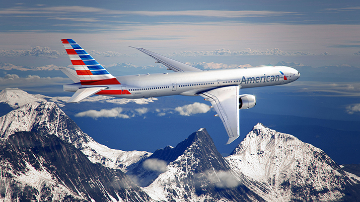
Crammed into the middle seat of last week’s news between the grounded Boeing Dreamliner and a new round of airline fees (this time from Southwest) was the unveiling of American Airlines new logo and livery. As part of an effort to revitalize the beleaguered brand, this is the first re-brand for American in over 40 years.
The familiar red, white and blue stripes along the side of the fuselage are gone, replaced by a new logo and “American” in large letters on the silver body. Red and blue horizontal bars are emblazoned on the tail. This replaces the iconic logo created in 1967 by famed designer Massimo Vignelli.
American, just emerging from Chapter 11 Bankruptcy, worked with IPG’s FutureBrand on the rebrand. According to the Chief Creative Officer at FutureBrand, the process began by asking the question “what are the things that are relevant from all over the world about America?” The answer they arrived upon: “Technology. Entertainment. Progress.” This helped guide the process. American has declined to say what the nearly two year rebranding effort cost.
The copy below, taken from American Airlines’ website, lends further insight into their strategy:
“For more than two years, we’ve been building toward a time when the outside of our aircraft reflects the progress we’ve made on the inside. Today, we’re excited to reveal the next step in our transformation.
We’re inspired by what we make possible—by our ability to connect you with the world around you. As we advance toward becoming a new American, we’re moving forward with great purpose and respect for our history—challenging ourselves to progress, to modernize, to innovate and to place you at the center of all that we do.”
With the turbulent nature of the industry and consumer satisfaction at an all time low, the rebranding was met with skepticism among consumers more interested in addressing frequent delays, lost luggage, soaring tickets prices, lagging loyalty programs, poor customer service and crowded planes than what color the plane is painted.
Personally, I read about the rebranding with a keen sense of deja vu. Once upon a time, way back in 1996, I was fresh out of college and lucky enough to be working for one of the big, old-school New York Ad agencies. I was about as green as could be, but was lucky enough to have a front row seat as the agency was assigned the task of re-branding USAir. Having just expanded for the first time with routes to Europe and following a split with partner British Airways, USAir was also looking for an updated image – and a change of perception from a regional carrier to a global player. After hundreds if not thousands of hours of meetings, much travel back and forth to their headquarters in Washington DC, many late nights, internal dramas, stops, starts, copious amounts of research and a nearly seven figure fee investment we had arrived on the big change that was going to propel the airline into the next century. We had a fresh new look, image, positioning and Brand. USAir had completely transformed into…USAirways.

Mobile-First Marketing: Why It’s Essential Today
Not long ago, mobile optimization was viewed as a competitive advantage—a forward-thinking enhancement for brands looking to stay ahead. Today, it’s the foundation. For most consumers, the mobile experience is the internet, shaping how they discover, engage with, and connect to brands every day.


