I have to admit, when I first heard that Louisville Slugger had revised their logo, I was disappointed. And a little dismayed.
I suppose this was partly due to the previous logo being so prevalent in my own memories of playing baseball, and partly because I strive every day to help my clients reach the level of worldwide recognition the Louisville Slugger logo had achieved. According to Ad Age, Louisville Slugger’s brand affinity scores outrank several heavyweights, including Harley Davidson and McDonald’s.
So, why make a change? After 129 years, the company would be undergoing just its second major logo revision – the first since 1980, when “Hillerich & Bradsby” took a backseat to the Louisville Slugger name within the familiar oval.
After a little research, the motive for the redesign became clear. In short, Louisville Slugger is being undercut by new brands with new technologies that appeal to younger players and coaches. While current major leaguers still have an affinity for the history of the brand, these players would eventually be replaced by those who grew up with a wide range of options and, thus, very little sense of nostalgia for Louisville Slugger.
The brand had to modernize in order to survive. And, with the launch of a revolutionary new bat, the timing was right to move forward with a new mark.
But how far would they go to appeal to a younger demographic? How much of their current look would they sacrifice?
After seeing the new logo unveiled on MLB’s Opening Day, I was relieved. The new logo truly is the next step in the brand’s evolution. My biggest fear – a complete redesign that appears to come out of, ahem, left field – was not to be the case. The design is clean, modern and continues to utilize several iconic elements.
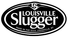
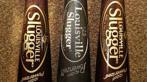
For example, while the word Slugger is now noticeably larger than Louisville, the double g font remains to help bridge the old and new logos. And, thankfully, the Powerized mark – complete with lightning bolts – is still right where it’s always been.
All together, kudos to Louisville Slugger for finding a way to update their appearance without abandoning their legacy. They’ve created a mark that might keep players of all ages swinging that iconic oval design for years to come.

Mobile-First Marketing: Why It’s Essential Today
Not long ago, mobile optimization was viewed as a competitive advantage—a forward-thinking enhancement for brands looking to stay ahead. Today, it’s the foundation. For most consumers, the mobile experience is the internet, shaping how they discover, engage with, and connect to brands every day.